Wednesday, December 2, 2009

Fingerprintssss

Im still adding in fingerprints to three or four places on these images after they print, this is the layout Im going to be using to display and showcase. Bah! :D


Tuesday, December 1, 2009

Positioningggggg

Still choosing overall positioning, I have a few other images I could put in, but I dont knowwwwwww, Im distracted but in
an okay way I think? hmm!
I have a little to think about it, Im sending in print forms tomorrow sometime :]


Choices!

I've been nabbing opinions on these two for a week or so now and I'd like some more opinions before I make my final decision! The first plate offers a more cohesive grouping and in seperate pieces still carries, but the second plate offers some odd depth that I would really like to provide in the collection. Hmm, comments? Last minute suggestions? I'm planning on printing tomorrow sometime ^_^

Plate 1:


Plate 2:

Tuesday, November 3, 2009

New Series Composite Image


Sizing currently sitting at:
Height: 9 inches
Width: 48 inches
Resolution: 300 ppi

Monday, November 2, 2009

Friday, October 30, 2009

Whoa!

Thanks for all the feedback at Crit earlier everyone! I think your suggestions hae really helped out and got me back on track! Heres it is, updates included, I used saved extras from earlier versions of this image to work back in and make altercations addressed in class- Im very happy with where it is now, especially as compared to where it was but a few short days ago- :]


MMHMMMMMMM

Tuesday, October 27, 2009

Hpyer-foucs out of conrtol?


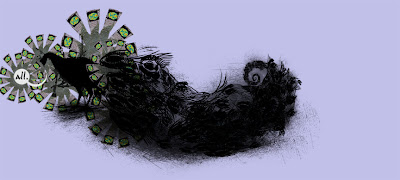
Heres the starting of my newest image, been working hardcore....but....I feel like I got into a state of hyperfocus and overdid the tail to this lovely peacock tenfold. Im posting this so I have a record of it, I've already started on the new tail with a new fade into space-

As Im going through this process, Im choosing my focal point, my animal silhouette based on how much identification one can draw from just a silhouette and a one or two details. Im seeing more and more through observation that we only need a few hints to tell us exactly what it is we are looking at.

There are only a few descriptive areas needed to define in our complex human minds;

Kingdom: Animalia
Phylum: Chordata
Class: Aves
Order: Galliformes
Family: Phasianidae
Genus: Pavo

All Im leaving out is the individual species.
Of which, only two major types exist for the peacock-

-Pavo cristatus
-Pavo muticus


One of the thoughts that really got me started on this was an old letter originally from Graham Rawlinson, a specialist in child development and educational psychology; in the letter he related an experience from his Ph.D. work at Nottingham University, a study which showed that randomizing letters in the middle of words had little or no effect on the ability of skilled readers to understand the text. Im sure you've all seen the email with offshoots of this as it has been passed around for years now, but in case you haven't heres an example:


"Aoccdrnig to a rscheearch at Cmabrigde Uinervtisy, it deosn't mttaer in waht oredr the ltteers in a wrod are, the olny iprmoatnt tihng is taht the frist and lsat ltteers be at the rghit pclae. The rset can be a toatl mses and you can sitll raed it wouthit porbelm. Tihs is bcuseae the huamn mnid deos not raed ervey lteter by istlef, but the wrod as a wlohe."


Chances are you also understand it. It purports that the order of the letters inside a given word doesn't matter, as long as the first and last letters of each word are in the right place.

His words were in part misrepresented through this forward, in response to its popularity he stated, "Clearly, the first and last letters are not the only thing that you use when reading text, If this were the case, how would you tell the difference between pairs of words like 'salt' and 'slat'."

Also, one permutation could result in many different words, and, while you can take into consideration the sentence's context, you would still be unable to be sure about the author's true intention of word choice. For example, the transposed letters of 'ponits' could spell out any of five different words – 'pitons', 'points', 'pintos', 'potins', and 'pinots.' In the forward, the sentences are simple and, given the unchanged words, one can deduce their meaning easily. There is some truth to the e-mail in that people can read sentences in which the letters are jumbled.

There is always a cost involved in reading such text in comparison to normal text, speed for example, but the interesting part is how easily it can be read....


Generalizing, with very few hints, like in the words of this partially conclusive word jumble study, is playing a lot into this new series.

Also notable! Two or three letters don't change at all, making them totally understandable.... Hence my use of three letter words from the mouths of the silhouettes thusfar. Not only that but I also am interested in how much meaning and content one word well-chosen can add to a piece-

I'm very happy with the series so far and have lots of good thought for pushing forward. I'm excited for continuing this trail :]

Interesting much! And thats where we are right now-
:D


Have a great afternoon!

And of cosure, remmeber to aviod excesisve drniking.

Sunday, October 18, 2009

Hold my place please!

My life has consisted of three elements since crit, work in the sense of my long term job, sleep, which has been happening less and less as of late, and work for this class. Its a good weekend to get obsessedd though because Ive got all the fresh thoughts and ideas from crit in my mind! That means it made lots of sense and was super helpful! Thanks everyone who has commented and given me such good feedback thusfar!

Heres the new piece!
1.5 feet height X 2.5 feet length at the moment, Height will prolly remain static, but Im still toying with the idea of length. :]


Oh- and Im still unsure as to choices in text thusfar, Once I have all of this put together as a series Ill be chill with making some concrete decisions there ^_______^

This is a fun colour

Ive Quasi-Decided on this one, it could still change, but for sanities sake I had to choose one. :]

Friday, October 16, 2009

A beastly beast needs.

If you read this.... comment. even if its short. I want to get this figured out sooooon- Im excited :D

Needs a backdrop, lots of choices, or maybe just leave it white.

Diagnosed with slight colorblind tendencies when swimming in greens and blues... heh, Jessica commented on it back in color theory :]

Im thinking something faint in colour, not too vivid, I dont want it to distract, but rather, to accent. Heh, accent. I love this University ^,^

Color vs Colour. Who invented the language? Choices! Choices!

+++++++++++++++++++++++++++++++++++++++++++++++++++++++++


Input? And why do you think what you do?

A


B


C


D


E


F


G


H


I


J

Eat it.

References to mind-set, color combinations, and the unusual point of view not often remembered- that’s what I like to take in during a day. Eventually my crazy notepads full of these notes click with an emotional pull and a piece unfolds. There is always a deeper story woven into my work's essence if you take the time to look.

When seen, I'd like viewers to be able to see deeper than the image. I want the colors to feel, the characters to speak, and the background to recede into their softened senses. Rocks are, after all, much more than rocks- they are geological wonders that have taken years and years to form and unfold from the earth’s belly. I strive for this communication always, and above all else, I want my story to be complete.

I'm very interested in the interaction of styles and competing areas of interest. I like to see people figure things out. It’s a story that with, but a glance, I can start to relate to the viewer my notepad, my life observations. Psychology can be delicious if you're in the mood. The processes of scanning in textures, working with my photography, utilizing all tools before me, and mixing my medias fascinate me to no end.

I strive to make my artwork an escape for real feelings- free flowing emotion; layer-by-layer the elements should begin to transcend the layers of this all-too-familiar skull for which I slave. I need it for me- I need it for those who care to look- people should delve into this vibrant world that surrounds us instead of being passive observers in a constant game of cat and mouse. This thought relation is my Mister Methamphetamine; the truth shoved up your nose. If fewer smiled with fake smiles, less voices cried with forced empathy, and more molds were broken in this society, my crystal observation and method would be commonplace. That day seems further by the minute to me. Till then, the brush be my focus and the palette my pill- I hope people understand, but in the end, it’s all mental and my release exists.

Wednesday, October 14, 2009

Attention = Zilch... but I like it :]

Heh, ADD kicking in, eh'? Heres the new image I've been on! Let me know whatcha thinkin. . . Have a SMASHING evening! ^_______^

Tuesday, October 13, 2009

Realizations! Ah! ^_^

Ah! So I just got my midterm feedback from Jessi and omigosh, its what everyone has been telling me for sometime now but I really didnt GET until now. heh. Something clicked in that email and I guess it took the repetition of the style twice and the words again to grasp it. Explain explain explain. Okay!

Consistency is key to developing identity.

I need to work harder to create more visual connections between pieces in the body of work; essentially the development of a unique identity for my work to possess; style security.

Correct me if I'm wrong, but one piece last semester and one this semester stick out to me that I REALLY felt good about...
Yes! These two!


Its not that the other pieces didnt speak or do their part, its just that these two FEEL finished and complete-They fit- I don't doubt them... I'm starting to think that may be an important concept to grasp for the future. Im going to follow this style after Im done with my current image. I'm ready to create a cohesive body of work. Thoughts? Cherries? Candy?

Work in progress...

Current project follows, this is real piecey and I still have a lot planned for it, but I just wanted to show what I've been up to the past while and perchance get some feedback on associations made with:

1) my creature on the left side of the image.

2) the right crescent form.

There is no right or wrong answer at this point- I just want some loose associations that come to mind when looking at the two channels of this image in progress. After I get some feedback I will know better how to progress to get my thoughts on screen. I uploaded with what seemed to be a fair size so detail can be observed if clicked on.

Planned:
Size: 5 feet wide x 3 feet tall @ 300ppi
Printed: on a watercolor or other available matte printing heavy weight paper.

Thanks in advance :)


Saturday, October 10, 2009

The Family


Last minute touches are done, Im getting ready to go ahead and print this one- Im thinking Ill get brave and apply this one to a piece of wood or something and turn this into a mixed media piece. Maybe add some finishing nails under each person and hang a key or something. IDK/ all up in the air right now. But this is it :) More to come soon- Ive been working for dayyssssss on this new image but its not to the point for constructive crit yet :)
The Family

Sunday, October 4, 2009

Pens.


Here is what I have been working on for the past week or... so :)

Title: Pens.
Size: 12x24in
Used:Scans, pictures, sketches, pen tool line art, custom brushes, lots and lots of overlays, etc.

After an in class critique I took the advice to do some model sketches and work more off of a human realism rather than a human thought. I like the change and appreciate the advice. Enjoy!

Sunday, September 27, 2009

End of week.

These last few here are my new projects, you cant really tell whats going on yet... but Im working on it. The first image is a slight change in text to better convey my message. The rest of this image is the same. Thanks.


Friday, September 18, 2009

Ritual Disconnect; Target: Family

Here's what I've been working on this week.. =)


Friday, September 11, 2009

Love em! AH! :D

A list of artists that I have been following. . . basically.

I would like input if anyone else can think of similar artists to these because I would like to try replicating some of their styles this semester. Some of these are just here because they are frickin' awesome too....Thanks! :D


---------------------------------------------------------------------------------------------------------------------------------------

Justin Cherry

http://nivbed.livejournal.com/

http://www.nivbed.com/

Michael Raaflaub

http://forums.cgsociety.org/showthread.php?f=137&t=764918

http://www.mraaflaub.ch/

http://mraaflaub.blogspot.com/

Alex Stodolnik

http://www.redbeardead.com/

http://deadbear.deviantart.com/

Ken Wong

http://www.kenart.net/fear.htm - top

Jason Chan

http://www.jasonchanart.com/gallery.htm

http://jasonchanart.blogspot.com/

Barnaby Ward

http://www.somefield.com/

http://twitter.com/barnaby_ward

Vania Zouravliov

http://www.thefader.com/2009/09/03/vania-zouravliovs-newest-girl/

http://www.lifelounge.com/Vania-Zouravliov-is-a-freaking-genius.aspx

http://www.myspace.com/299705267

Jason Thielke

http://www.jasonthielke.com/

http://www.joyengine.com/tag/jason-thielke/


Oliver Polanski

http://www.oliverpolanski.co.uk/

http://www.pvuk.com/artist/oliver_polanski-portfolio129_1.html

Added!

Late add for the class, but I'm going to be working hardcore to catch up ASAP and make up for lost time- sooo, expect goodness.

auf wiedersehen.

Monday, May 4, 2009

Finished

Im done with all my pieces, critique is over, and now the plunge till next semester- I'll be working on new projects all summer, Im excited for the end of one, and start of a new semester soon.  Peace, and see you all Wednesday-

Wednesday, April 29, 2009

And... the finished product ^_^


AHaha! Its TOTALLY finished. Movement completed. Tied everything together. I cant wait to print! =D

I wish I had clever titling like someone =]


VibrANCE defines life. Open it. Free it.

contrast may look a bit bugged out at the moment, but I have done some tests surrounding image to surface transfer and colour changes and if this goes correctly, this will be perfect once applied and worked back in.

Butterfly Effect FInished


first image is the completed version utilizing the feedback I got from several crits and the visiting artists personal input on the piece. The second image has been composed for a different type of metal Im thinking of applying this piece to. Im still deciding on whether or not Im going to use it, and whether or not I can get ahold of exactly what I want. I've been searching for several weeks now- looking for the perfect homes for these images to be transferred.

Refinished in green


Working well- this image is sooo done. Im printing very soon so I can get my transfers completed by critique =]

Wednesday, April 8, 2009

Steves visit and critique on my work was most helpful and I got a lot of valuable insight into how to make some key elements in a few of my pieces to click. I'm going to be working on fixing those spots up and making things flow before I move onto new work now I think ^^

Monday, April 6, 2009

Beat Beneath the Surface


Uploading everything holy.... or at least a good bit of it. These are the pieces that I've been working on the past few weeks that needed some finishing touches. Here is beat beneath the surface.

Purpose


Lets call her finished. I'm totally happy with this piece =]

Shackled Vibrance


Its been a while in the making, and I think its finally ready to be here, this isn't my typical work, but then again, whats typical.

Wednesday, April 1, 2009

Monday, March 23, 2009

Lady Umbrella and Horse


I think this is going to go into the category/thought of humanity and their rejection of animals. I dunno, were still working on its full concept.

Drapery Lady Sketch Update

She is now being used in a painting and has adapted quite nicely, its in the painting studio and I'll show it later when it dries =]